
As we hurdle at breakneck speed towards those cold dark nights of Autumn and Winter we wanted to shine a light on some well-known and not so well known examples of User Experience (UX) horror stories that resulted in terrifying, or at least extremely frustrating, outcomes for users.
We’ve included some more recent examples that aren’t as absurd and others that are now scarily decades old. Whatever their age, they will forever more serve as cautionary tales in the world of UX design, as they highlight how poor design, unclear interfaces, or small oversights can lead to disastrous or even life-threatening situations.
Let’s explore these examples and see if any are eerie enough for a new season of Black Mirror, or perhaps just quirky enough for a light-hearted, everyday annoyance like missing the right button on a vending machine.
Travel user experience horror stories
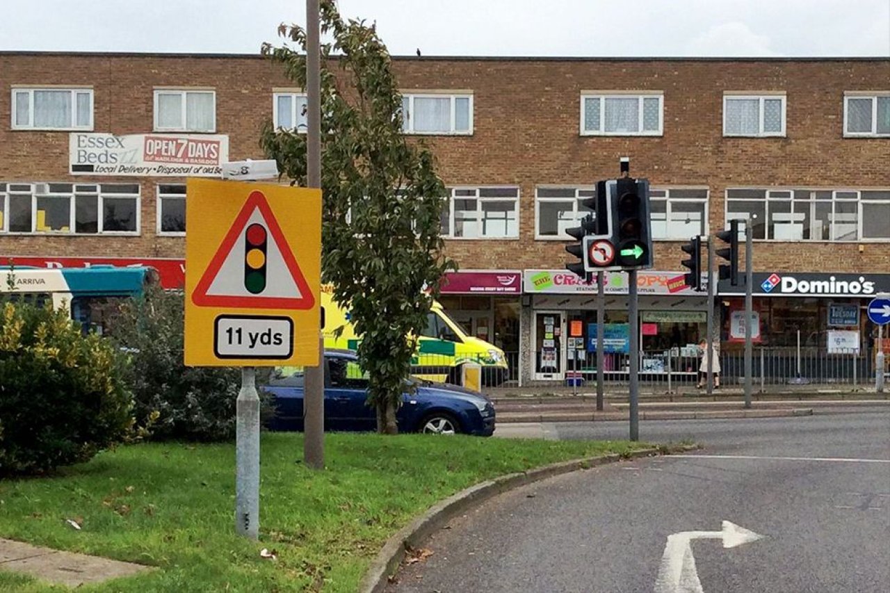
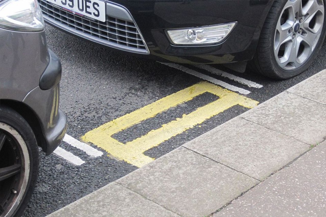
We’ve all came across inconsistent or confusing road signs such as contradictory speed limits, poorly placed warnings, or absurdly short yellow lines. All of which are often a result of poor planning, lack of clarity in design, and outdated processes. Road authorities often neglect to update signs causing driver confusion, potential safety hazards, and inefficient road use, leading to frustration, inaccessibility, and possible accidents.
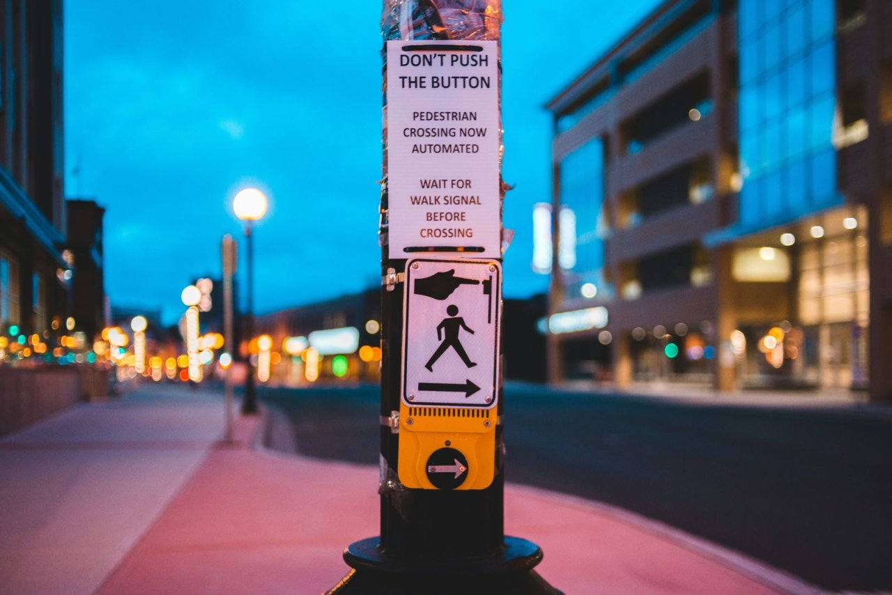
Changing to pedestrian signals (5th Avenue and 11th Street in Manhattan, New York City)
In 2015, the city implemented a new set of pedestrian signals at this busy intersection to improve pedestrian safety and control vehicle traffic. The signals required pedestrians to press a button to activate the walk signal. This change was part of a broader initiative to enhance pedestrian safety in urban areas.
The result
Pedestrians experienced confusion due to a lack of clear feedback from the signals, inadequate visibility of buttons, and poorly coordinated signal timing. This resulted in situations where pedestrians were uncertain if their button presses activated the walk signal, leading them to cross at unsafe times when vehicles still had a green light. Tragically, this failure culminated in serious accidents, including fatalities.
The cause
Primarily due to inadequate user feedback, poor signal timing coordination, not meeting accessibility guidelines, and visibility issues, making it unclear for pedestrians whether their button presses had registered. Additionally, insufficient testing and a design focus that prioritised vehicle traffic over pedestrian safety contributed to misunderstandings about when it was safe to cross.
Lessons learned
The unfortunate results highlighted the dire consequences of neglecting user-centred design in public safety systems and the need for more thorough user research and testing, clearer feedback or alerts, and enhanced visibility in traffic signals. It is clear that users and public health and safety wasn’t deemed or treated as the highest priority in this case, which it must always be.
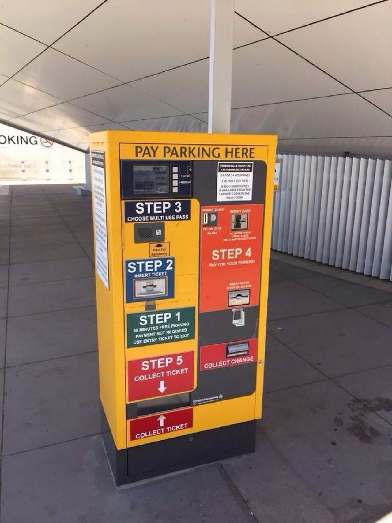
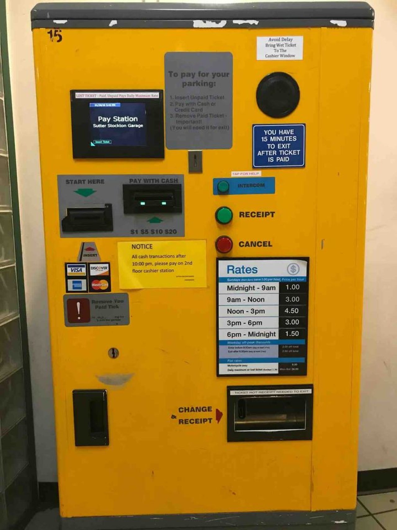
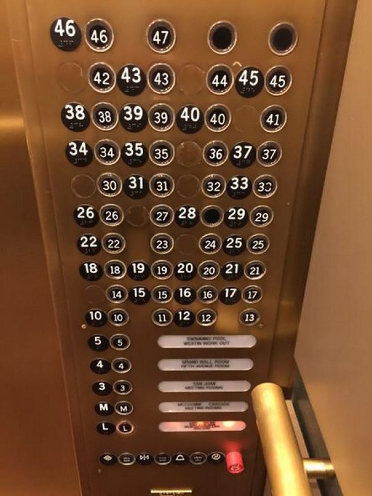
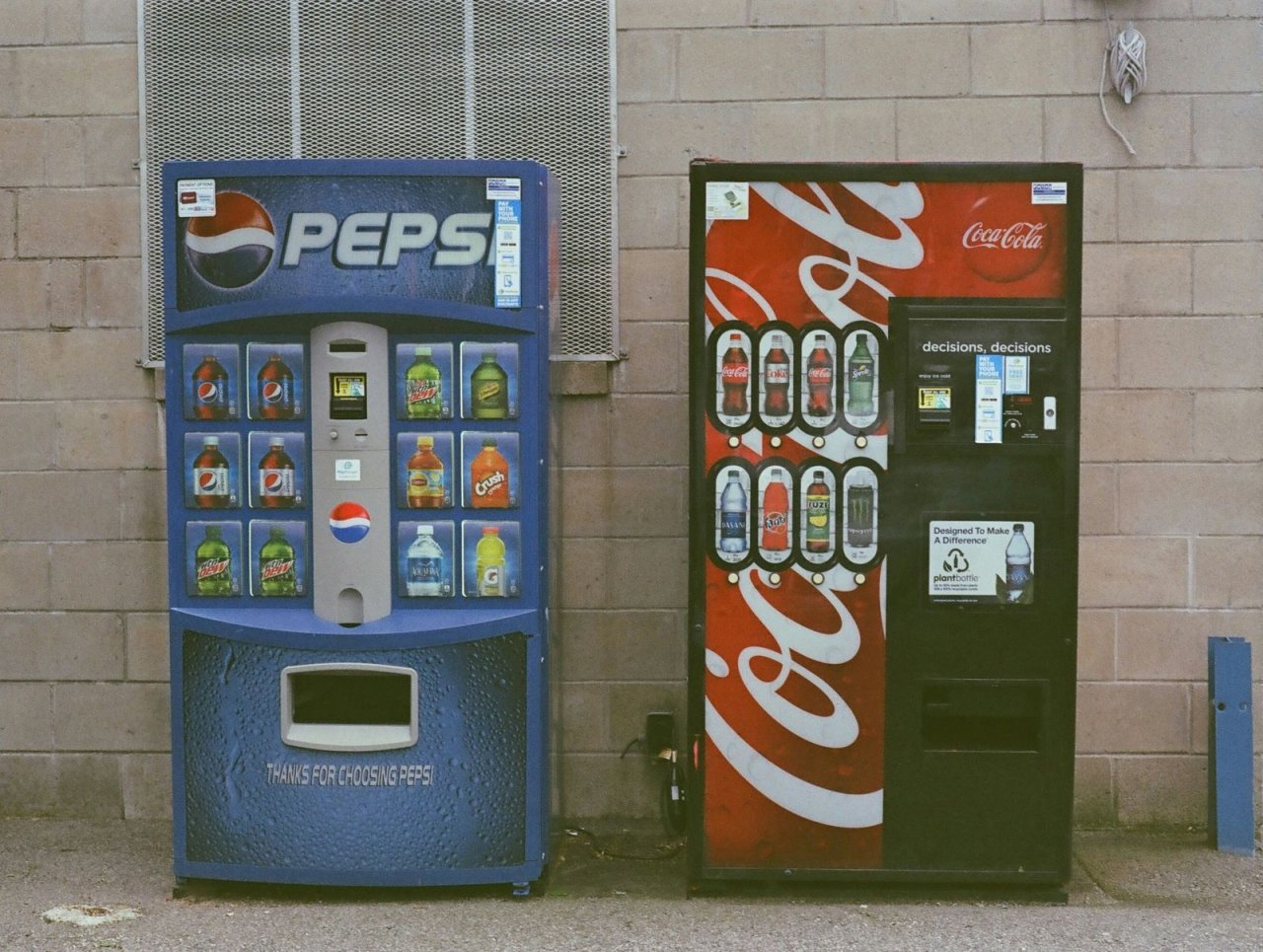
Public displays of bad user experience
If you are familiar with travelling on public transport, using public toilets, leaving a multi-storey carpark or even picking a packet of crisps from a vending machine when you are at the hospital. You’ll have come across complex interfaces, unclear instructions, inconsistent button layouts, poorly labeled controls and payment options leading to confusion. These all link back to poor design including a lack of standardisation, over complicated layouts, outdated technology, and lack of consistency.
Unfortunately, we are often the ones to pick up the pieces as a result of these scenarios wasting time, losing money, leaving frustrated and in some cases even having safety concerns in emergencies. You may have came across some similar UX horror examples like these:
The "Kill All Humans" vending machine incident
In a somewhat humorous but eerie case, a Coca-Cola vending machine in 2010 went viral after users reported that a hidden code sequence on the machine’s touch screen led to a message reading, "Kill All Humans."
The cause
The message was a remnant of developer humour left over from testing and development, accidentally left in the live software. Essentially, the hidden sequence was a joke that wasn’t intended for the public.
The result
While it was mostly taken as a joke, the unsettling message was certainly a surprise to users and raised questions about the professionalism and oversight in software releases.
Lessons learned
If thorough quality assurance testing had been performed, it could have picked up and removed any unintentional developer messages or humour entered from all public-facing user interfaces and avoid alarming or confusing users. A message like this in the current age and rise in popularity of AI may alarm some of you iRobot fans out there.
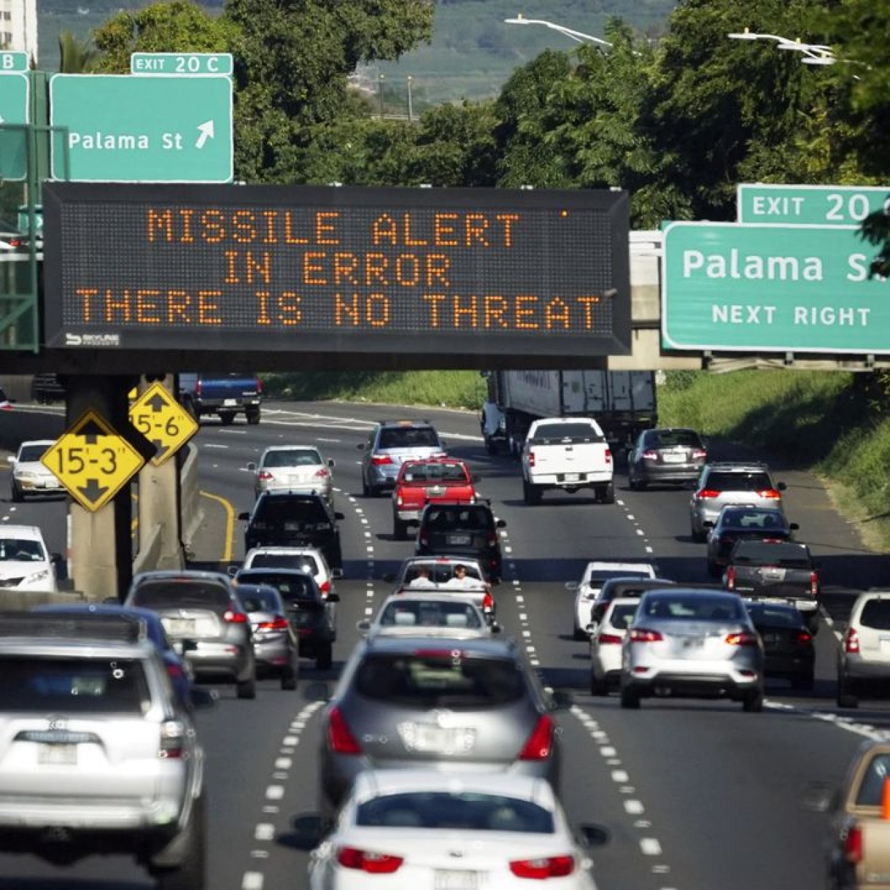
Hawaii false missile alert (2018)
In January 2018, residents of Hawaii received a terrifying emergency alert on their phones saying that a ballistic missile was inbound, and it was "not a drill." Panic ensued for nearly 40 minutes until it was revealed that the alert was a mistake.
The result
The message alert was sent causing mass panic across the state, as people tried to find shelter or contact loved ones. The state had to apologise for the error, and it was a global lesson in how important, clear, unambiguous user interfaces are, especially in emergency systems.
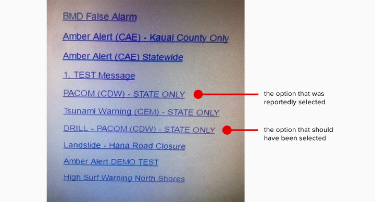
The cause
The alert was sent because an employee at the Hawaii Emergency Management Agency chose the wrong option from a dropdown or select menu. The user interface presented several similarly worded options, including “TEST”, “DRILL” and “ALERT” without proper safeguards to prevent such a catastrophic mistake. The lack of clear distinction and confirmation steps between these options was a critical design flaw.
Lessons learned
Clear feedback and error prevention: Interfaces in critical and emergency systems should always have clear feedback mechanisms such as a warning or confirmation step and prevent users from unknowingly making catastrophic mistakes (e.g., missile alerts).
A universal user experience mistake
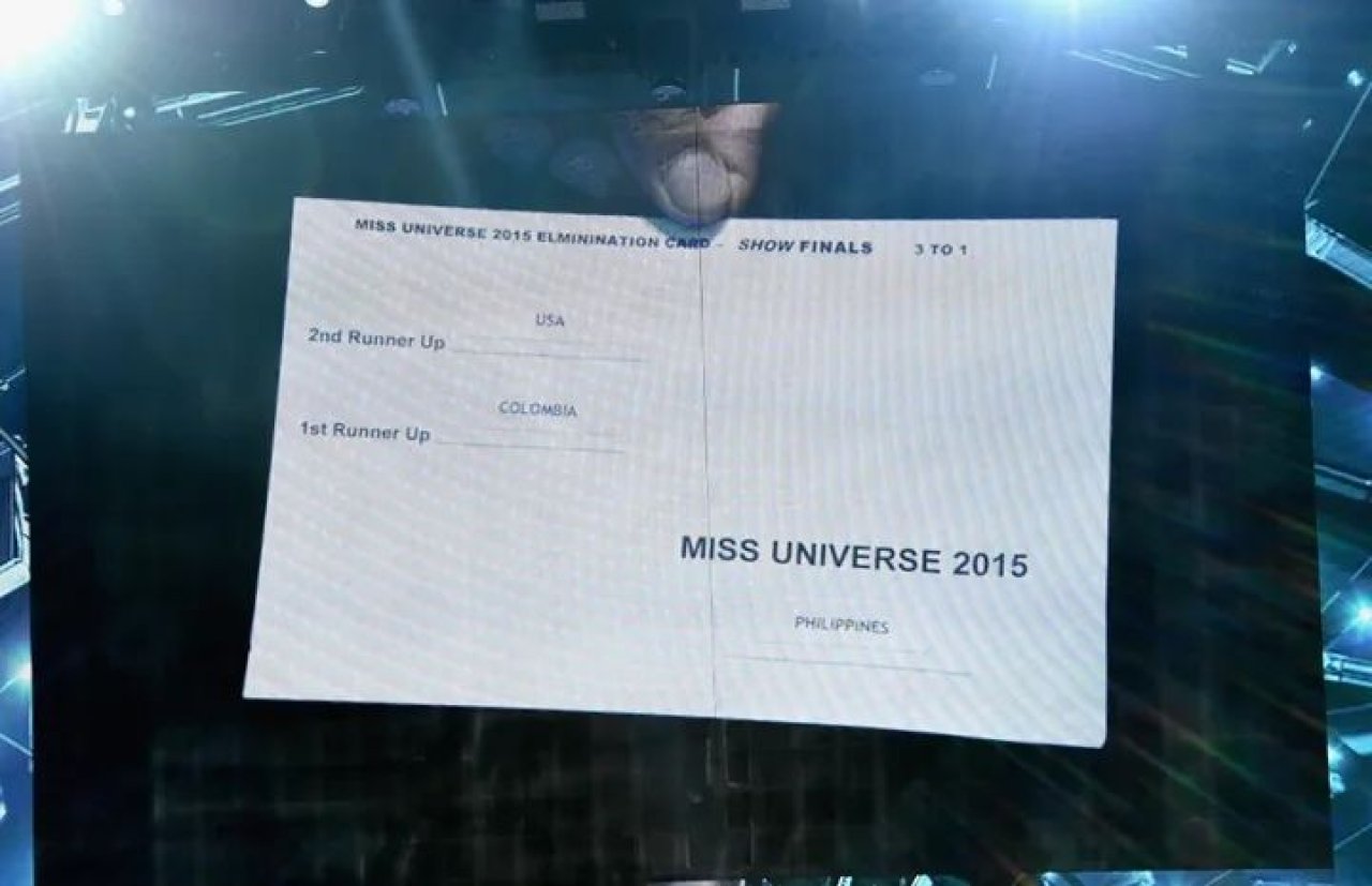
Steve Harvey Miss Universe (2015)
We all remember when Steve Harvey announced the wrong winner at the Miss Universe pageant back in 2015, mistakenly crowning Miss Colombia instead of Miss Philippines.

The result
There was worldwide embarrassment, confusion on stage, and a public apology from Harvey, which overshadowed the event and caused significant distress to both contestants and the organisers.
The cause
The results card was poorly designed, with the winner’s name placed on the right in small text, while the runner-up's name (Miss Colombia) was more prominent on the left. That’s a simple design mistake to make, right? Or is it left?
Lessons learned
Clarity is key when presenting important information—critical details, like the winner, should be prominent and easy to read. Consistent layout design helps avoid confusion, as placing secondary details in primary positions (like the runner-up name) can lead to misinterpretation. Additionally, user testing under pressure is essential to ensure designs function as intended in real-world scenarios.
Don’t cause horror for your users
Even small design missteps can lead to major setbacks. These UX horror stories both big and small remind us how crucial it is to get things right to avoid scaring your users away, causing frustration and damaging your brand.
The above examples show us the importance of the processes we follow here at Logic+Magic to provide the best possible user experience for our clients’ users:
Having a clear, intuitive design - Misleading or unclear interfaces can lead to catastrophic outcomes. We ensure your designs are user-friendly, follow best practice and are easy to navigate, preventing costly mistakes.
Error prevention and feedback - Critical systems as shown, need safeguards and clear feedback to prevent user errors. We implement effective design solutions on a daily basis for our clients that anticipate issues and guide users smoothly throughout their journeys.
Accessible design - In the UK, around 22% of the population is classified as disabled or having an impairment, according to government statistics. Our goal is always to ensure those with disabilities, can interact with systems and products easily and safely. Early fixes and testing prevent barriers that could lead to frustration, exclusion, or safety risks. For example, unclear controls or confusing layouts on parking machines, elevators, or vending systems can particularly impact individuals with visual, cognitive, or motor impairments. But, get it right and you ensure a more inclusive experience, reduced costly fixes later, and enhanced overall usability for everyone.
Safety and usability: From product recalls to fatal accidents, safety must never be compromised. Our UX solutions focus on both functionality and safety to enhance user experience and protect businesses from critical failures.
At Logic+Magic, we offer expert UX services that ensure you dodge mistakes like these to keep you and your colleagues on the path to success. We also hold dear our user-centred design principles and approach that not only engage but also avoid the pitfalls that can harm businesses, no matter what we go to do.
Contact us today to find out how we can help you integrate UX into your digital projects now.

Senior UX Designer

