Expertise
- Web Application Development
- User Experience Design
Client:
Payzone
Industry
Payzone: domain consolidation and CMS implementation
Payzone is a leading multi-channel service provider, backed by AIB and Fiserv. They have been connecting people to payments for over 20 years, processing millions of transactions through their network annually. Logic+Magic were asked to design a solution which would allow Payzone to consolidate several existing products into a single website.

The strategy
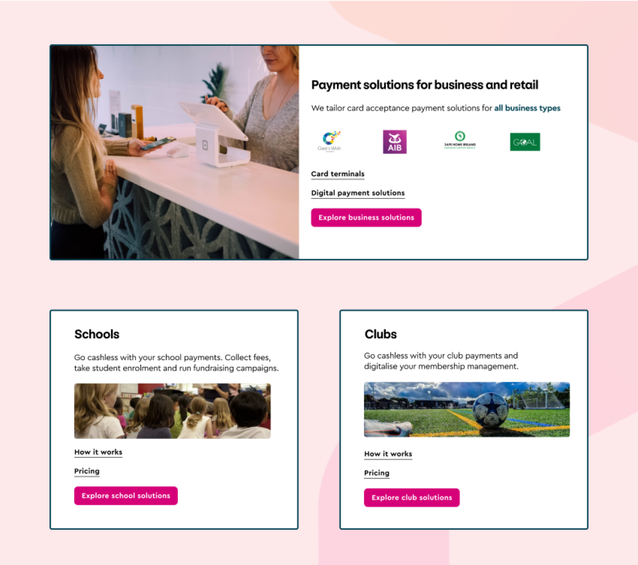
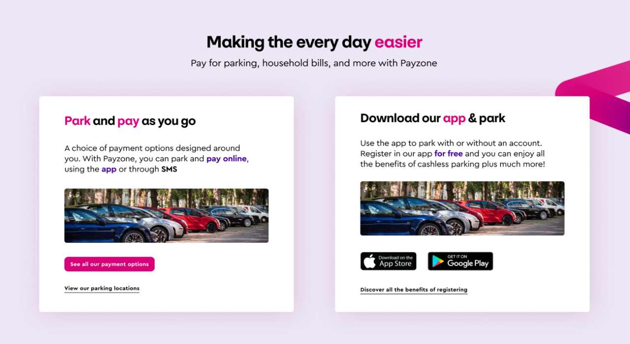
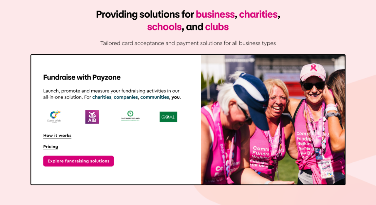
Payzone’s offering covers several different services, each with different needs. Communicating the different products available to each of these markets was challenging as they existed in separate silos.
The result required a single website that embraced user-centred design thinking and aligned it with the company’s long-term strategy of bringing Payzone direct to the consumer.
The website needed to be based on an easy to use and future proof CMS and express the new brand through creative design.
The solution: discovery
The project began with our customised project plan outlining our strategy and how we’d work with key stakeholders, tapping into foundational research insights.
This stage is designed to gain a profound understanding of Payzone’s business goals, market position, and unique differentiators. Armed with brand, market, and business intelligence, we set out to chart a path that would not only address current challenges but lay the foundation for future success.
Our first action was to perform in-depth analysis of existing research and brand documentation along with a meticulous review of competitors and comparators within the market. This provided valuable insights that would serve as the compass for our journey.
During the discovery phase we believe it’s imperative to agree between all parties the best way of working together. This dialogue was instrumental in fostering a collaborative spirit that would permeate the entire project.
The solution: UX research
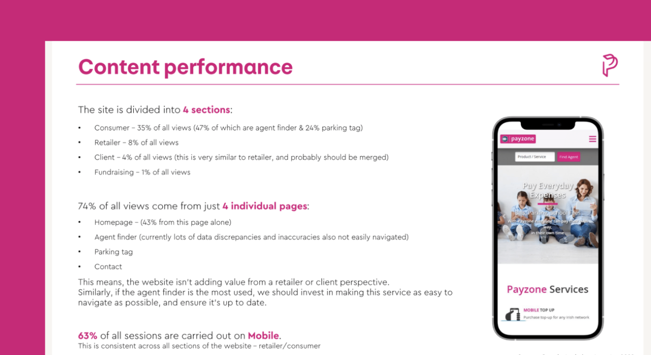
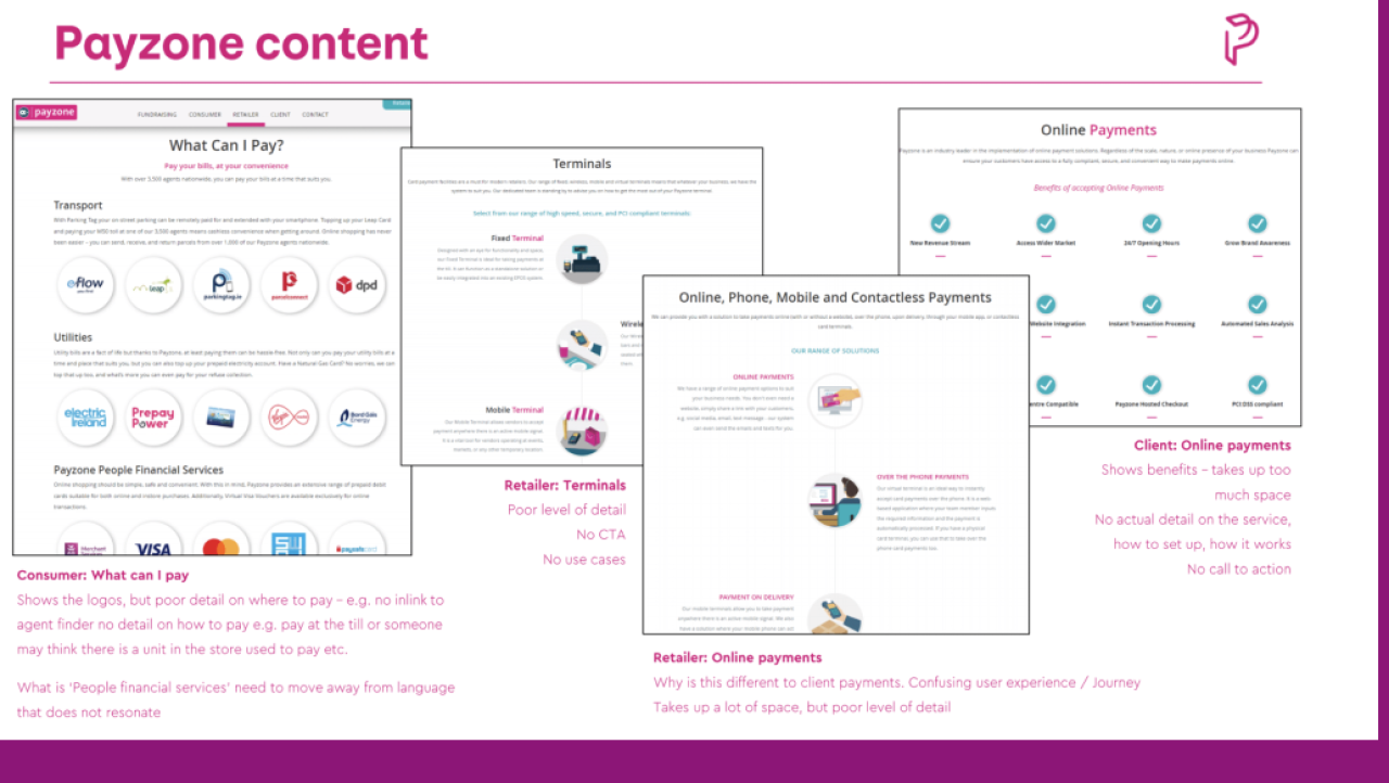
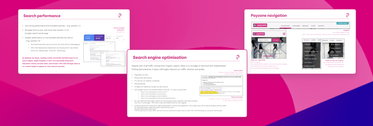
By benchmarking the current sites which would form part of the final website we were able to identify moments of truth and pain points within the user journey.
Our exploration into the user experience was multi- faceted, combining various activities and methodologies:
Page-level and interaction-level analytics through GA and Hotjar.
Desk and secondary research, gathering industry insights and best practices.
Exemplar Identification, identifying best-in-class user experiences to set a high standard for our project.
Navigation research through activities like tree testing to optimise the menu structure.
Structure and content with best practices for discoverability.
Armed with these insights, we aimed to refine the information architecture and flow to enhance the user experience.
The solution: UX + UI design
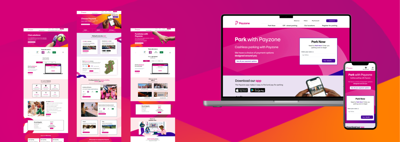
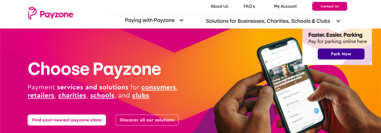
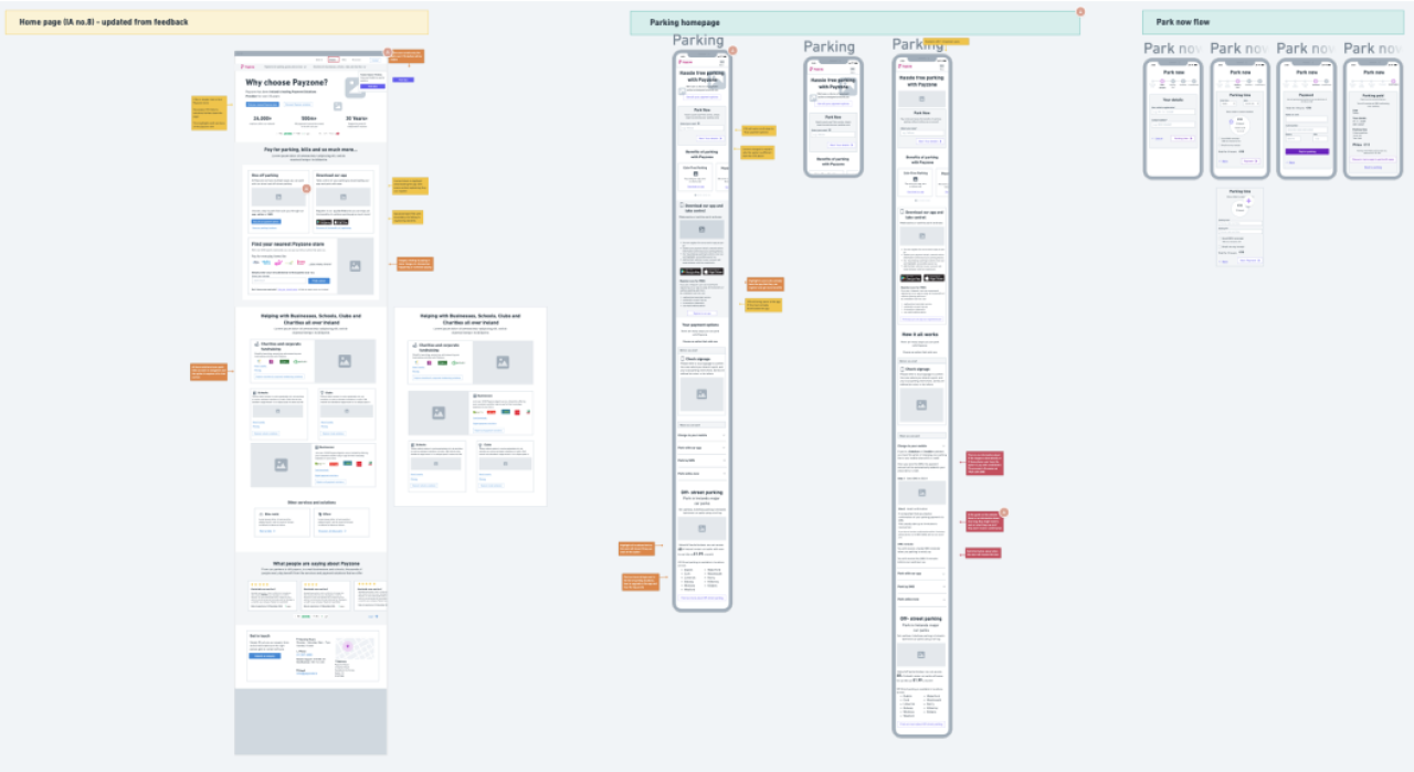
Our wireframes and UI designs drew from the user insights gathered during the UX research, ensuring that the interface resonated with the intended audience.
Wireframe development received careful thought to both desktop and mobile experiences. We also addressed managed retirement design, ensuring a seamless transition for users from older domains to the new interface. Messaging considerations were woven into the design, making sure that communication was clear and on brand.
The core of our design effort was the creation of UI elements for key screens. This involved not only the layout and arrangement of elements but also some iconography to enhance visual communication.
To guarantee consistency during the build, we developed a design pattern library encompassing all aspects of the user interface, including colour schemes, typography choices, and graphics styles.
As with all our builds, accessibility was a core consideration throughout this process, ensuring that our outputs were inclusive and compliant.
The solution: development
The choice of Drupal CMS was pivotal to our technical direction for Payzone. Drupal's intuitive content management system interface not only simplified content updates but also allowed for easy scalability. Its reputation for security and robustness provided a solid foundation for future development.
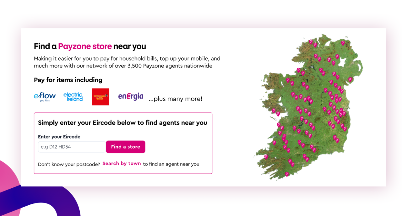
Part of the functional requirements were to provide location-based services to customers looking for Payzone merchants, well as managing the import of that data.
We added functionality the CMS to ensure this data was presented effectively on the website and reliably imported when new versions of the data were provided. This required a deep understanding of the structure and user requirements.
As always quality was at the core of our development process. Rigorous quality assurance checks were performed to ensure that the website met both functional and design standards. This involved internal teams systematically testing each aspect of the website’s functionality to identify and resolve any issues or discrepancies.
